 Are hashtags dead? Today we’ll learn more on how hashtags greatly affect Twitter growth factor when it comes to followers. we’ll also get some Excel tips! Thanks to Peter Bray for sharing this article.
What factors go into determining how many Twitter followers you gain (and lose) each day?
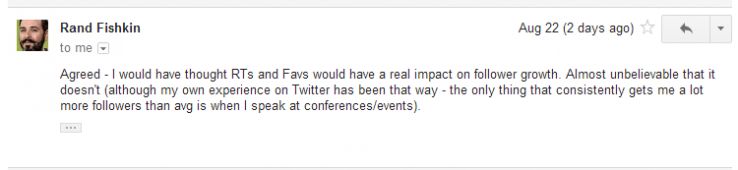
I was driven in part by Rand Fishkin’s recent “mad scientist” experimentation that he touched on at MozCon. There, he noted that his tweets with images resulted in significant follower losses.
Do they? And what other behaviors result in more (or fewer) followers?
I’ve found some interesting gems.
Of course, it’s worth noting that aggregate, general trends don’t necessarily speak to your specific situation. In fact, as you’ll see, they’re often exactly the opposite! To that end, I want you to play along at home…
You’ve got new data!
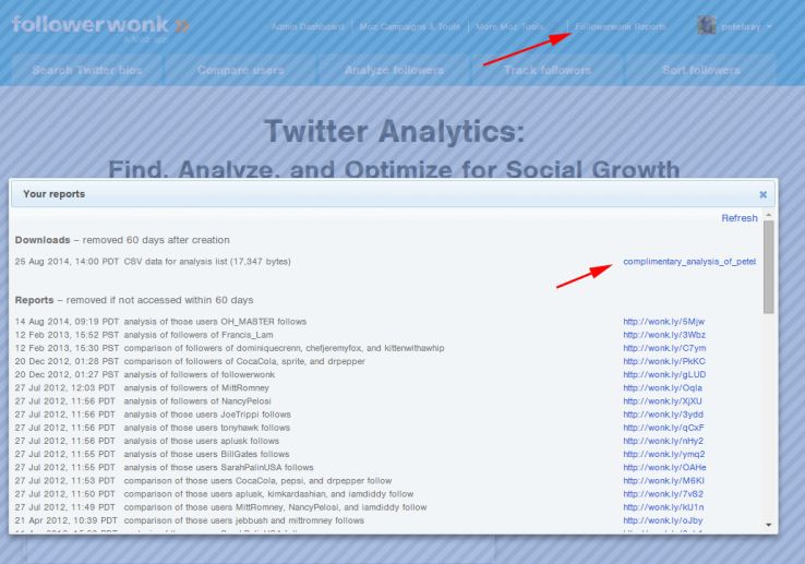
If you’re a Moz subscriber who has had their Twitter account connected to Followerwonk for three or more months, then chances are you’ll find a new complimentary report there. (I also only computed these reports for those who have more than 50 Twitter followers, and who tweeted in at least 10% of the days analyzed.)
Once you’ve downloaded the report, please clean up the data. Look for any days with zero gains/losses that look wonky (i.e. something should be there but isn’t). These are either Twitter or Followerwonk outages. Delete them AND the day immediately following outage. This is important, as the day following outages usually has outsized gains to make up for the missing date. It can heavily skew any statistical analyses.
If you’re not a customer, no worries; this blog post highlights some pretty interesting general Twitter growth metrics.
(I am going to repeat this offer again in a few months—in fact, we may build it into Followerwonk. So subscribe now to ensure that you have plenty of social graph history for analysis. Please tweet me to let me know if you find this data useful. We may build it permanently into the product if so!)
Followerwonk has unique data for deep mining
We track social graph changes for thousands of users, and we compute new and lost followers on a daily basis. We’re one of the only companies that to do this (maybe the only one).
Sure, lots of sites compute net changes; but we track gains and losses, and we track who your new followers (or unfollowers) are. This is a huge set of data to explore to look for significant trends, to get hints as to what causes follower growth, and more.
This post is an introduction to that exploration. We’ll cover a lot more in future posts (including analyzing the types of users that you gain after specific Twitter or offline activity).
Let’s take a look.
I deeply analyzed Twitter content and compared it to follower growth (and loss)
I created a day-by-day summary of new and lost followers. My data set included roughly 800,000 “days” for over 4,000 users, and requiring analysis of millions of tweets.
The result was a large spreadsheet with a lot of content metrics.
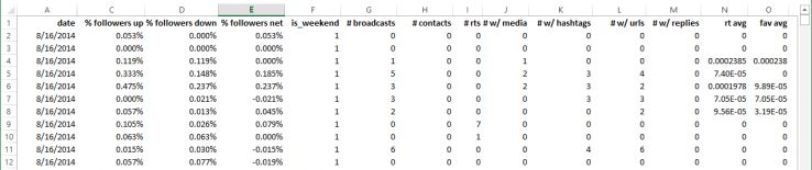
For example, I determined the # of tweets with images, those with URLs, those that are “broadcasting” vs those that are @mentioning someone, and so on.
I did this because my hypothesis is that follower growth (and loss) is significantly impacted by the content that one tweets.
Let’s break out Excel
For all of my analyses, I use that old Microsoft stand-by: Excel.
I’d typically recommend R: It has a lot richer analytic capability. But it has a much steeper learning curve, and I wanted this blog post to be a bit of a tutorial, so Excel fits the bill.
If you’re following along at home, you’ll want to first enable Excel’s “Analysis ToolPak.” Dunno why, but Microsoft chooses to turn it “off” by default. This add-on allows you to easily perform correlations, linear regression, and more.
Mean, median, mode, mangos…
As a first step, I like to get a lay of the land via basic descriptive statistics.
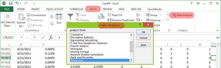
To do this in Excel, find the Data Analysis tool, and select Descriptive Statistics. Check the box labeled “Summary statistics,” then select all of the columns with numeric data, and you will get a summary table.
(Of course, sometimes scientific notation is hard to read at a glance. To remedy, I highlight all of the numeric cells, right click, and select “Format Cells.” Then I change it to “Number” with 4 decimal places.)
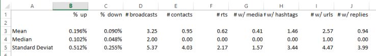
Remember, this is analyzing 800,000 days across several thousand Twitter users. We see that the average daily account growth in new followers is about 0.2%, while the average daily account loss is 0.1%.
By the way, it’s worth pointing out that this isn’t necessarily a representative sample. It’s an aggregate of mostly Moz/Followerwonk customers. And it spans the range from very big Twitter accounts, to very small ones (where getting a few new followers will result in outsize daily % gains).
What correlates with what?
I select Data Analysis and choose “correlation.” I select all of the numeric columns as the input range.
I get a nice table of results!
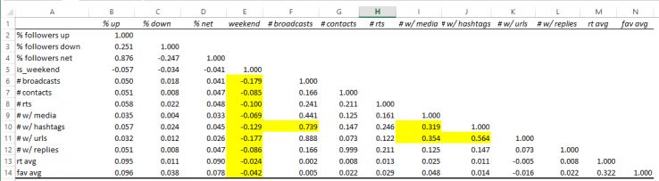
There’s some interesting stuff here:
- Weekends correlate slightly with fewer tweets and activity across the board. That makes sense.
- Broadcast tweets (that is, those that don’t begin with an @mention) correlate highly with tweets with hashtags. Approximately 45% of broadcast tweets in our sample contain hashtags.
- Tweets with images correlate moderately with tweets with hashtags and with URLs. And, in turn, tweets with hashtags correlate moderately with tweets with URLs. This also makes sense. In many ways, images, hashtags, and URLs are all facets of marketing. When a user employs one, he is likely to employ the other two.
Of course, the relationships between tweets with URLs and tweets with hashtags is fairly simple.
It’s a lot harder to understand, for example, what variables predict follower growth (or follower loss). After all, there are a ton of different factors at play. And, as we see from the correlation chart, only a few things stand out.
First, pay attention to the percentage daily growth of followers compared to follower loss.
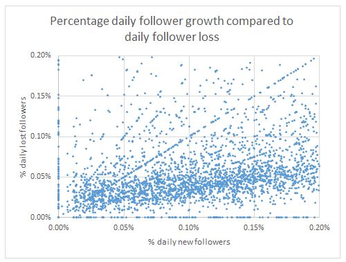
Just eyeballing, you can see that people are gaining followers at roughly twice the rate that they’re losing them. (The strange diagonal lines are a side effect of small accounts gaining and losing 1 follower in a day.)
Also, take a look at RT rate and favorite rates compared to follower growth. The correlations are pretty low at less than 0.1%, but you can definitely make out a bit of a trend.
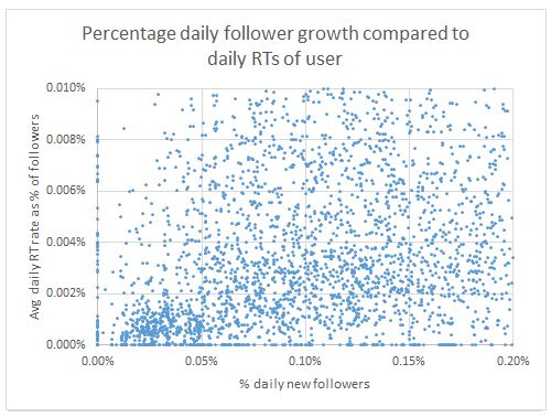
This relationship makes sense to me. RTs and favorites reflects a tweet’s value and virulence. The better the content (presumably) the more likely it will be RTed. And the more RTs it gets, the more likely that user will reach non-followers, who may then decide to follow.
The problem with correlations, though, is it’s hard to see through the noise. So many factors contribute to growth.
What we want to do is look at a variable and “strip out” all other variables’ influences.
Enter linear regression
Regression lets us use multiple independent variables at once: day of the week, time of day, type of tweet, whether it has a URL, and so on. It then isolates each one, stripping out any “interference” from the others, to test their predictive value to the dependent variable. This lets us test each variable in its pure form.
In our case, the dependent variable is the daily % followers up (or down). This variable depends on the others. (Well, that’s our hypothesis, in any case.)
It’s quite easy to perform linear regression in Excel.
Select the Data ribbon. Click on Data Analysis. Select “Regression”. Then, for the Y Range, enter the dependent variable: namely, the % followers up column. For the X range, enter all the other columns (up to 16). Select “labels” to tell Excel that the first row contains labels to name each variable. Then hit Ok.
I first played around with the daily % gain.
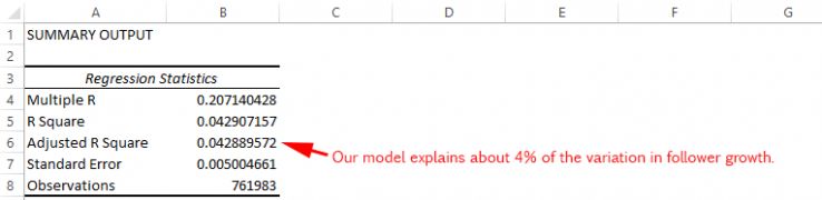
Adjusted R Square is the statistic to pay attention to. Here, it tells us that our model explains over 4% of the variation in new followers.
Doesn’t sound like much, right? But, actually, it is!
Consider if you were able to explain 4% of stock market movement. Or interest rates.
Remember, too, that this is across thousands of users and 800,000 combined days.
So what’s moving the needle here?
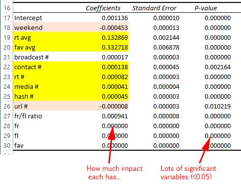
Pay attention to the ones I’ve highlighted. Look at the coefficients: these tell us the impact that a one-unit move in the independent variable has on the dependent variable.
By way of explanation, consider that the average daily follower growth for a user is 0.00196 (or 0.196%). On weekends, we can expect a drop of 0.000453. That doesn’t sound like much, but that amounts to a 23% drop in follower growth!
Of course, while you don’t want to mistake correlation for causation, you might take some general lessons from this analysis in terms of follower growth:
Each additional tweet with an image or hashtag corresponds to a 2% increase in new followers.
This makes intuitive sense. The use of hashtags (found in 45% of broadcast tweets) exposes content to others it might not normally reach. Similarly, images make content more attractive for casual viewers of one’s account.
Each additional retweet a user makes is associated with 4% more new followers.
It’s hard to know why there’s such a strong relationship with this one. And, by the way, I am talking about retweets a user makes of others (not ones his content earns from others). I suspect it’s because RT’d content is typically better-than-average content. It probably makes one’s timeline more attractive to previewing users, and may result in RTs of the RT (thereby exposing you to a new audience). Moreover, the attachment of one’s name and avatar (both on the RT itself, as well as associated with the originating user) likely accrues additional views.
Engaging with others is associated with 6% more new followers.
This confirms that Twitter shouldn’t just be a broadcast medium: that it’s important to engage and respond. It likely increases your overall RTs, exposes your content to others (via those watching the engagement from others’ timelines), and more. However, in our analysis, the out-sized gains may be “artificially” inflated by the accounts in our analysis that have zero engagement. These somewhat spammy accounts simply broadcast out links and other flotsam, and are therefore associated with far fewer new followers.
Each additional tweet with a URL is associated with fewer new followers.
Do links really add a ton of value to your followers? Particularly if that content is already ricocheted all over one’s existing network? Probably not. And so it may turn off new followers. As well, see my theory above. Tweets with URLs are the mainstay of spammy accounts. To the extent that our analysis included these users, the association between fewer followers and URL tweets is strengthened.
Weekends are terrible: you can expect 23% fewer new followers.
Save those tweets for the weekday!
Creating great content (and therefore getting RTs and favorites) is good.
Kinda obvious. But it’s nice to see this confirmed. There are strong associations with more new followers and retweets and favorites of your content. These actions, and retweets particularly, hint at the importance of virulence: the more RTs you get, the more exposure your content has to potential followers outside your network.
These are just general rules after analyzing many 1000s of days and users.
Things change dramatically when you analyze specific users. Through regression, and a bit of trial and error, you can uncover some pretty magical growth factors. (Well, I consider them magic anyway.)
Enter Rand: Do his image tweets result in fewer followers? What about conferences?
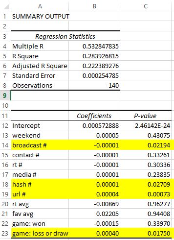
I used linear regression on just Rand’s data: his daily follower growth and tweeting metrics. Here are the results:
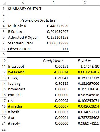
We can explain 15% of Rand’s daily follower growth variation in our model! This makes sense, because it’s custom tailored to Rand and so will fit better than the one-size-fits-all model from the aggregate analysis.
There are two standouts:
- On weekends, Rand can expect a 22% decline in new followers.
- Each additional image Rand tweeted associates with a 4.6% drop in new followers.
This confirms Rand’s own experiment: when he purposely spent a few days tweeting travel-related images. Perhaps these tweets were too off-topic? Or maybe his sudden change in tweeting behavior is to blame?
As he points out, it’s interesting that RTs and favorites of his tweets aren’t associated with new followers for him.
After all, in our general analysis, we do see that they play a significant role for most folks. Perhaps Rand’s retweeters are typically the same people over and over? Or in the same universe of folks who already follow Rand? (Thus he gets exposure to few new folks.) Interesting considerations for future research.
Rand hinted at something else in his email: that he feels that conferences are the real growth driver for him.
And he’s right!
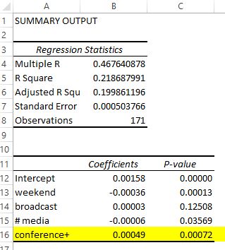
I coded the days Rand spoke at conferences. Adding this variable (and removing a few others) bumps Adjusted R Square up to 20%. Conferences account for a notable part of the variation in Rand’s follower growth.
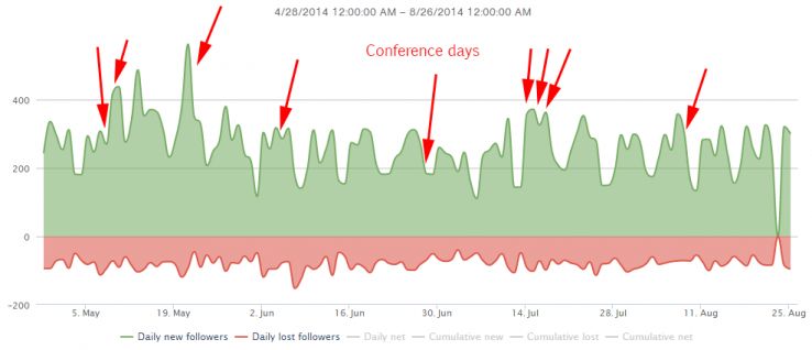
Yep: every time Rand speaks at a conference, we see an associated 31% greater daily growth in new followers. (Incidentally, I also analyzed days Rand did White Board Fridays, and these weren’t significant.)
What’s cool about using regression is you can test hunches such as this. If you look at the arrows in the chart above, it’s not immediately clear that those days are “more” than others. Remember, after all, that a ton of other factors contribute to each day’s gains (or losses). Through regression, we’re able to strip out influences from other variables, and focus just on one influence.
In the analysis of your data, maybe you want to code different events you attend? Or days when you make a blog post? To do so, just create a new column in the spreadsheet. Mark each day as a 0 when you didn’t write a blog post (or whatever); and a 1 when you did. Then include this in your regression as one of the independent variables.
Time to get negative? What drives follower losses?
So far I’ve highlighted what drives follower growth.
But we can also run regressions on follower loss. Remember, in Followerwonk, we track new followers and lost followers separately. Follower losses are those users who unfollowed you on a given day. Simply use as your dependent variable the follower loss column. And, as we did before, all of the others as your independent variables.
Here’s a really interesting one for a major sports team.
We can explain 22% of their follower loss in our model.
Notably:
- Each broadcast tweet is associated with a smaller follower loss of 1.4%. Broadcasting tweets are good. As are RTs and contact tweets with others.
- Hashtags and URLs perhaps turn their users away? They are associated with significantly more follower losses: particularly for links!
I also encoded when they won or lost games. Winning games had little effect.
But for each losing game, their follower loss increased by 56%! That might seem kinda obvious: but not necessarily. Since games are typically on weekends, you might assume that follower loss is simply a “weekend effect.” Via regression, though, we know it’s not. That losing days are significantly associated with losing followers.
Key takeaways
- The types of content you tweet have significant impacts on attracting and keeping followers.
- Hashtags probably aren’t dead.
- Each tweet that includes an image, has a hashtag, is a retweet, or mentions someone associates with 2-6% more daily followers.
- Just as it does with Rand, your account will likely have individualized factors that move the needle for you.
- You can explore these via Excel! Check your Followerwonk account for a complimentary spreadsheet of your Twitter activity.
- Don’t forget to follow me @petebray so that I can test whether this blog post significantly moves my follower count! 🙂 And let me know what you uncover.
This article was originally
published by Peter Bray on
Moz.com
This content is syndicated news that can be used for your research, and we hope that it can help your productivity. This content is for educational purposes and is not made for any kind of commercial purposes of this blog.